Final Drawing
|
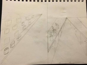
1 pt Perspective
I learned that every line has to point to the vanishing point in the middle.
|
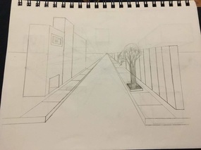
2 pt Perspective
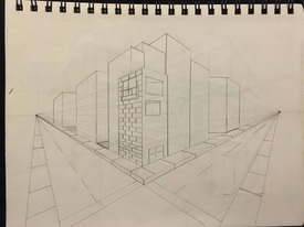
Every line on the concrete part points to the opposite side.
|
3 pt perspective
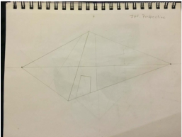
Not all lines go to the left or right vanishing points but the middle vanishing point
|
|
Values
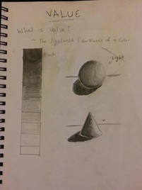
when i did the Value chart, i used a regular pencil. it didn't really help because all the values i did looked the same but using a drawing pencil makes a huge different and it looks better
|
Two sketches
These were my ideas for my Final drawing. i chose the drawing on the left because the drawing on the right was a little difficult to draw for me. I already knew how i wanted to draw the picture on the right so i went with that one.
|
Final Drawing
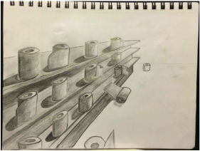
I came up with this idea of the falling paper towels because i saw rolls of paper towels on Ms. Rossi's shelf. When i started the drawing, i drew the paper towels just sitting but i saw that it looked boring so i drew some of them falling and when i added value to them, i saw that it looked even better so i just went with it. learning how to add value helped me a lot with this drawing.
|
Pen & Ink Chart
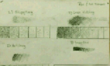
stippling, Hatching and Cross-hatching is easy if you have the right pens. I used a regular pen but i didnt really like it, then i used a sharpie pen and it looked much better.
Pen & Ink Bottle
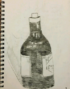
I really liked doing this drawing because i helped my practice . I used hatching for this because i thought it was easy and it kind of was.. i messed up on some parts but other then that i learned a little more how to use hatching.
Pen & Ink Form
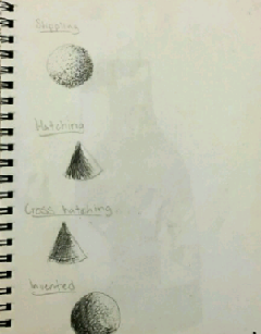
Doing these exercises really helped me. I thinking stippling was the easiest because it was just dots but the hatching and cross hatching was a little more difficult because you have to be really careful with your lines and my were all over the place but i managed to correct myself.
Perspective Sketch
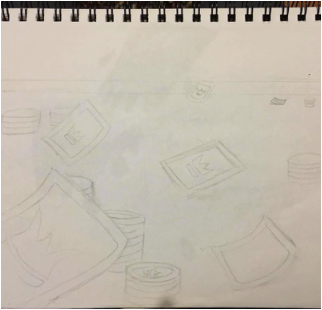
This was my sketch for my perspective drawing, its a sketch of playing cards and chips
Perspective Drawing
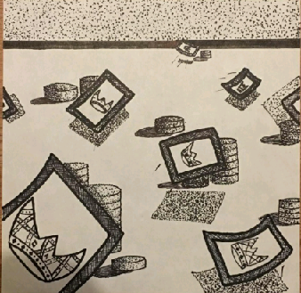
For my final pen & ink drawing i didn't do a fairytale drawing. I drew something random, i was planing on drawing something with joker throwing cards but i couldn't really draw the hands correctly so i just went with the cards and the chips. I used cross hatching and stippling. I used stippling on the shadows of the cards and then cross hatching on the edges of the playing cards. One thing i could`ve changed is the color paper to a green piece of paper.but other than that i feel like i did a good job on it.
Pen and Ink – Perspective and Fairy Tales
SELF EVALUATION
1. Discuss your decision on pen and ink techniques. Why you chose to use one or more.
4. Why is value so important in this project?
5. Describe your craftsmanship (How well the project is crafted technically)
6.If you could recreate your piece what would you do differently to enhance your final outcome?
7. (Only answer if you did fairytale) Which Fairytale or Fable did you create? How did you represent the story in your own way?
8. When applying the pen and ink techniques why and how is it important to make sure you understand the concepts taught in class?
9. As a growing artist how do you think what you have learned will guide and better your future projects.
SELF EVALUATION
1. Discuss your decision on pen and ink techniques. Why you chose to use one or more.
- On my drawing i used some hatching, cross hatching and stippling. I used these three because i wanted to see how it would look with these different techniques
- I used perspective by making the playing smaller so it can look like they are moving further away. Perspective is important because if you want to make something look like it further away then you got to know how to use perspective correctly.
4. Why is value so important in this project?
- Value is important because if you want to lead the eye from one place to another then you have to know how to apply it correctly because if you apply alot of value on something small and apply less on something really big then it wont really look good.
5. Describe your craftsmanship (How well the project is crafted technically)
- I used stippling on the shadow of the playing cards so i made it look like it was in the air .
6.If you could recreate your piece what would you do differently to enhance your final outcome?
- If i could recreate my artwork, i would use a different color paper like green because the idea of my drawing was playing card being thrown out on a playing surface and the surface is normally green.
7. (Only answer if you did fairytale) Which Fairytale or Fable did you create? How did you represent the story in your own way?
8. When applying the pen and ink techniques why and how is it important to make sure you understand the concepts taught in class?
- It's important to understand these techniques because if you don't know how to do these techniques then you probably won't know how to apply them correctly
9. As a growing artist how do you think what you have learned will guide and better your future projects.
- I think that these techniques could help us in future projects by adding more values on some parts that need it, and its easy to apply them
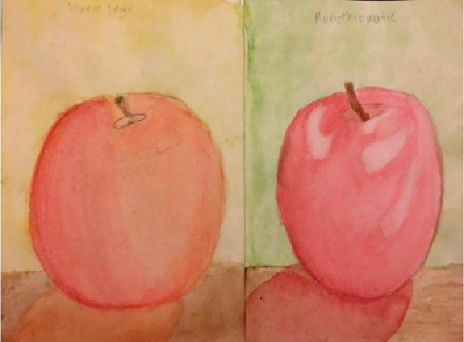
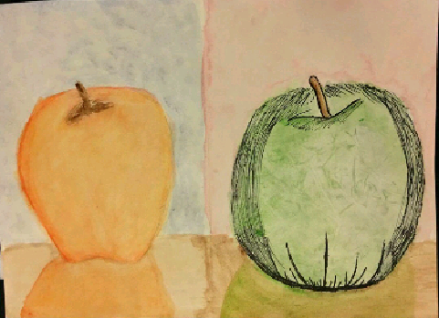
Water color Apples
|
|
Drawing apple was sort of difficult for me because i couldn't get them to look actual apples. I think painting with watercolor paint was a little hard for me because i couldn't get the value right but when i used the colored pencil (the left apple on the right picture) it was easier to use
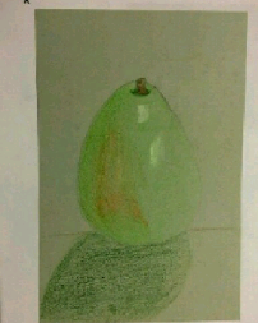
Colored Pencil Fruit
|
|
|
When i started drawing it i wasn't really good at it but then i got the hang of it. The pear on the left was the first one i drew, the value was alittle off. The drawing on the right was the next on i drew it still was a little off on the value the picture on the middle was the last one i drew i feel like i did a good job on this one though the shadow was a little off.
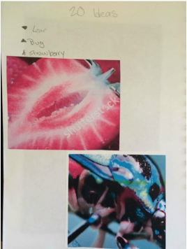
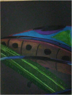
Georgia O'Keeffe Project
Project ideas
|
|
At First I didn't know what to do for this project so i just looked up pictures and i found these and they looked interesting so i chose them. I really liked the bug, it looked really cool, and the strawberry looked interesting. For my Final drawing i chose to do the bug.
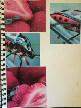
Six Sketches
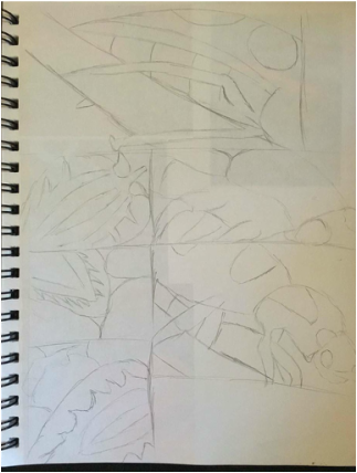
These are my six sketches for my two pictures. The strawberry was pretty easy to draw but the bug was a little hard to draw because it had a lot of parts that were difficult to draw but i was still able to draw it. I chose to do the bug because it has a lot of colors.
In Progress Pictures
I started adding color to my drawing, i used Prismacolors because they blend together well and some of the colors look really cool. i tried adding a lot of value on its stomach part
|
In this picture i finished the plants arm i tried adding different values but it was kind of hard to do. but i think it came out really good. I like how it's coming out
|
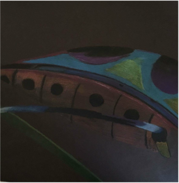
Final Drawing
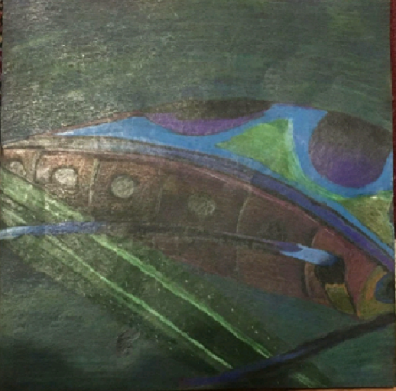
This is my final drawing. I really like how it came out. i think the best thing about it was the color blending, especially on the background where i blended green and blue and a little bit of white. I like the sky blue i used on the top part of the bug. it was a little hard changing the values on he main body. other than that i really enjoyed doing this projects it helped me understand how prismacolors work.
Self Evaluation
1. Describe the craftsmanship of your drawing. (Is it neat and well executed?)
4. Describe your choice of colors/color harmonies and how you used them throughout the artwork.
6. How did you use textures, highlights and shadows to enhance your artwork?
1. Describe the craftsmanship of your drawing. (Is it neat and well executed?)
- I think my drawing is well done, there are a few parts where i couldve done better but other than that its well executed especially the background i really like the background
- i feel like i did use a full range of values especially on the plants arm and the bugs stomach. although it was a little difficult for me to change values
4. Describe your choice of colors/color harmonies and how you used them throughout the artwork.
- In my drawing i used different kinds of greens and blues. For my background i used light green and blue, i blended them together.
6. How did you use textures, highlights and shadows to enhance your artwork?
- I used highlights by adding it on the side of the bugs shell so it can look shiny. i used shadows on the plant part by adding dark color under the bug's legs so it can look like its 3-D kind of and not flat
- A difficulty i had was the value, i feel like i didn't have right value on some parts. Something i could do to improve my drawing is the value on the stomach. i feel like the value on that part was a little off.
Value Chart
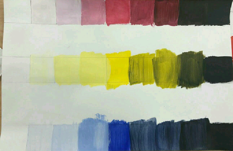
As i was doing this, it helped me blend the darks and the light colors together.i really liked doing this assignment because it was easy and simple. it was a good warm up for the project we did. though i rushed alittle on it cause in the end of the black part i got out of the lines and it looks messy.
Color wheel
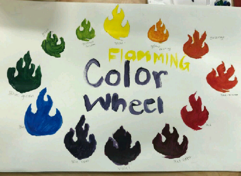
Doing the color wheel helped me because i learned how to make different colors, i felt that on some color i made the looked that same as the previous, for example on red and red orange , they kind of look the same but it was still a good practice for me.
Recreating a painting from an artist
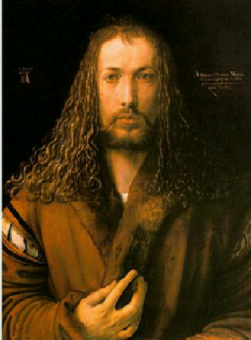
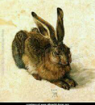
|
Albrecht Durer was a german artist whos art was mostly portairts and selfportraits he did a lot of paintings of animals and he also did some religious art work at one point, what really inspired him to be an artist was trip he took to italy and studied a lot of italian artists.
|
|
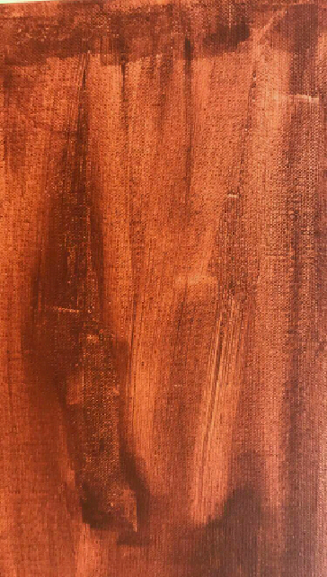
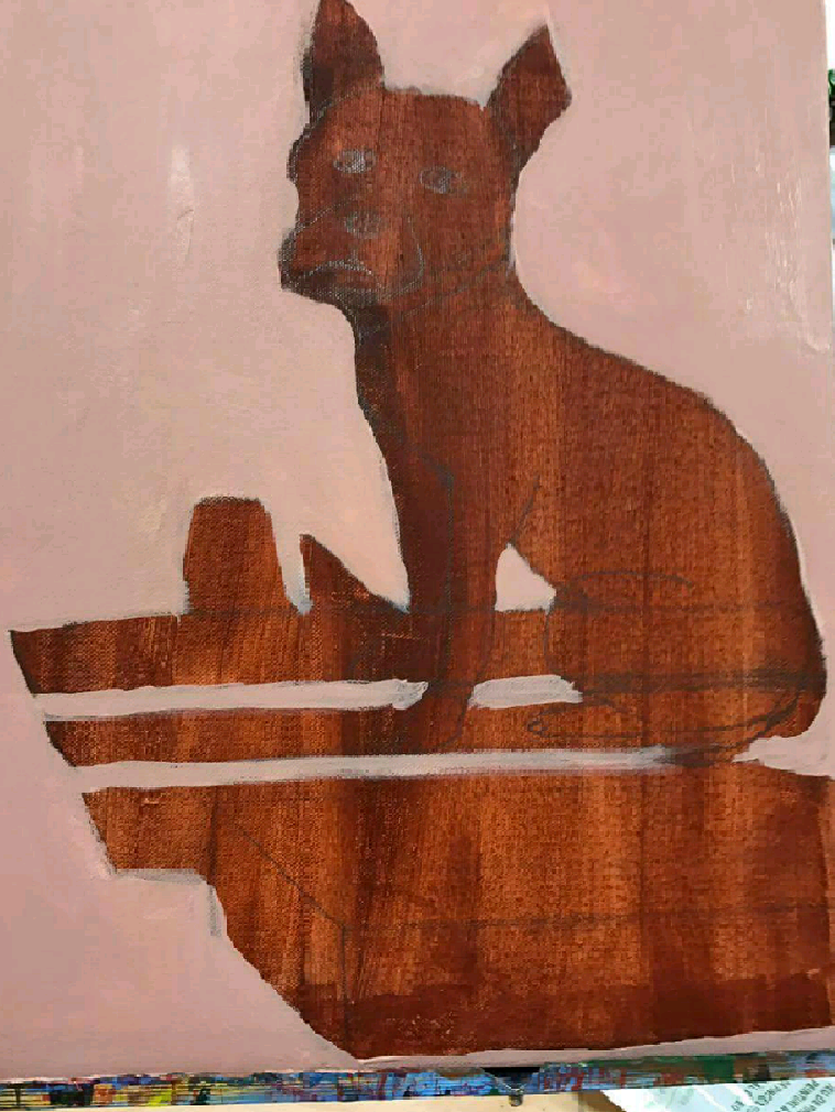
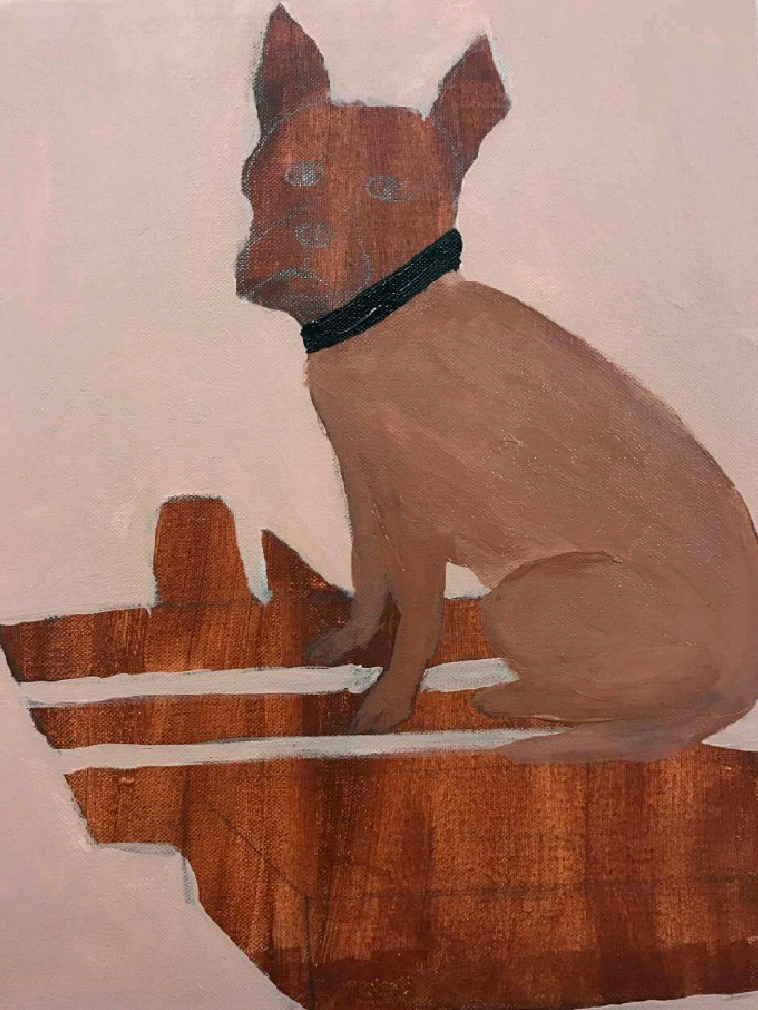
Recreating artwork
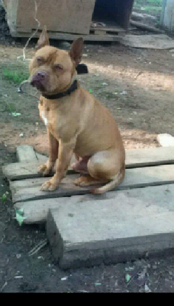
So for my project, ive decided to paint my dog because thats what Durer did, he paint portraits of animals .
In progress Pictures
|
|
|
Final painting
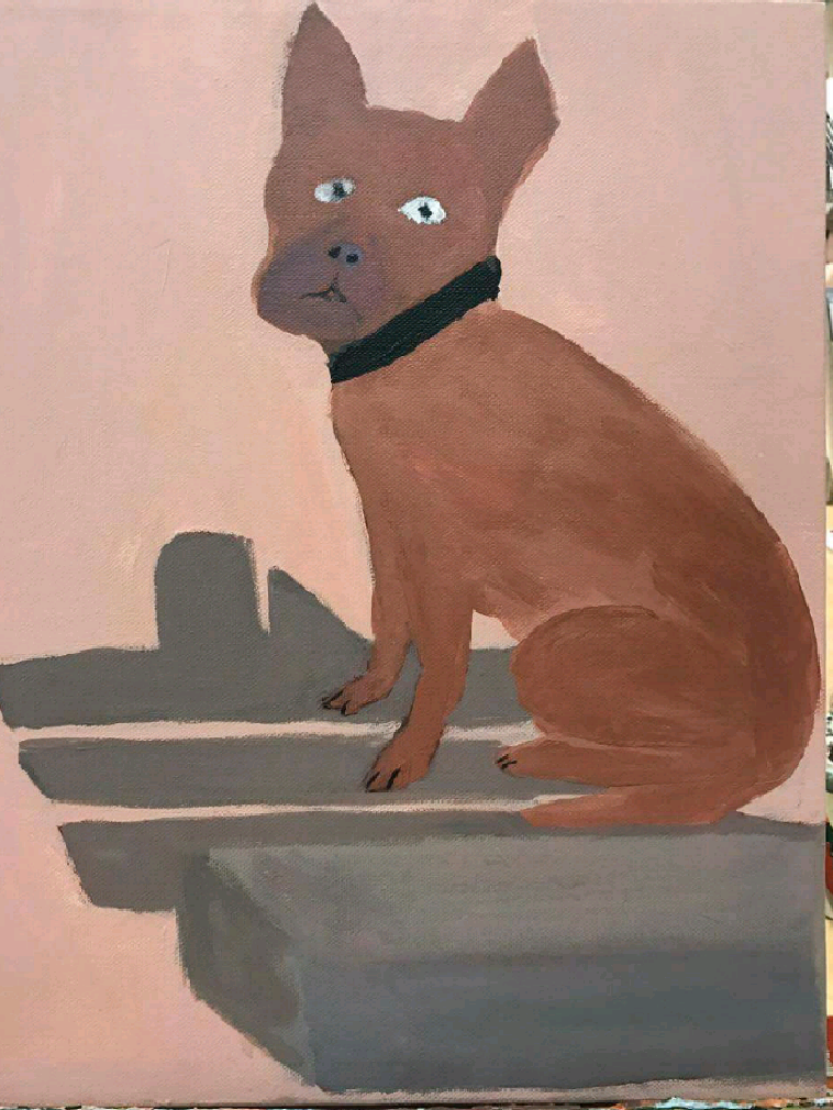
This is my final painting. i feel like i did a good job on it. i really like it. i used good colors on it it was a little different for me, ive never done animal painting, but i really liked this project, i think Durers style was alittle hard, hes painting all looked very realistic, it was a challange for me because ive never done something like that, but other then that it was fun working with paint. something i would change from my painting is the color of the background, maybe a more yellow whitish background beacuse it fits his style more
Critique Questions
Landscape in the style of an artist critique
Name:
Self Evaluation
- Who was your referenced artist for the painting? Name 4 main ideas you used from your research to create your painting.
1. Color
2. type of painting
3. style
4.
2. Describe the craftsmanship of your painting. (Is it neat and well executed?)
I think my painting was neat, it had some texture. i used some good colors, though there was some parts that i could have cleaner lines
3.What was the most difficult part of this project?
Since i did my dog , for me the most difficult part was doing the head and his face, i couldnt really get his eyes correct or his mouth but in the endit come out okay
4.Describe your color choices and how they reflect the work of your chosen artist?
The colors i used for my painting were brown with some white added to it. those color are what durer used on most of his animal portraits so i think i chose them based on what he used.
5.Describe how the style of your landscape reflects your chosen artist.
i noticed that Durer did alot of animal portraits so i did one too, i chose to do my dog
6. What do you think your chosen artist would say if he or she could see your painting today?
i think he would say to work on the detail more and you lines because i think i didnt have much detial on my painting
7. What would you do differently if you were to do this project again?
If i could do this project again , I would Change the color of the background because in most of Dürer's paintings, the background is yellowish .
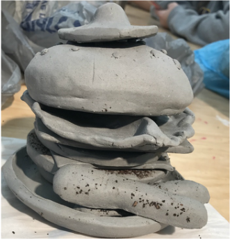
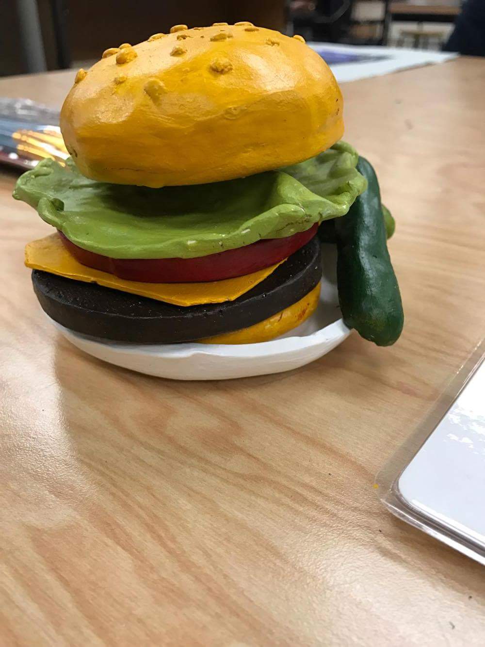
Clay food Project
|
Expectation
|
Reality
|
|
|
|
Clay Food Critique
Self Evaluation
1. Describe the craftsmanship of your sculpture. (Is it neat and well executed?)
Self Evaluation
1. Describe the craftsmanship of your sculpture. (Is it neat and well executed?)
- it was really nicely executed, i think it looks really realistic and the color makes it look even more realistic, the texture of the patty is really nice because i used coffee grounds which added texture to it.
- making the bun was the most difficult because i had to get it hollow so it wouldn't break when it was in the kiln.
- some colors did work. though i couldn't get a tan color for the bun so i just used yellow.
- constructing something is better than drawing it because it looks really cool, then to do it in 2D because you can actually add texture and its easier.
- in the patty, i used coffee grounds, when it burned in the kiln, all the coffee grounds burned off so it left the patty looking rough.
- yes. with imaginaaaaaaaaaaationnnnnnnn. well i think it does look realistic, it actually came out really well. better than i thought it would
- i would work on the colors, since i didnt have enough time to get all the colors right, i had to paint the bun yellow rather than a tan color but other than that it came out really nice.
Print Making Project
|
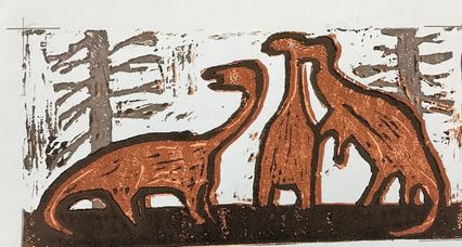
|
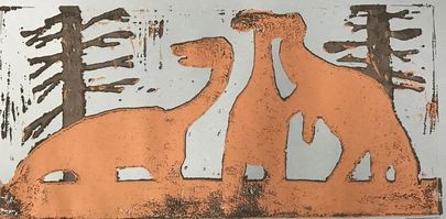
Doing this print making project was hard because well the carving part was easy but the layering was hard and confusing because i didnt know what colors to start with or what colors went next.
ART 2 CRITIQUE- Four Color PrintsYour name:
SELF EVALUATION
Ink coverage was difficult for me because I didn't know what colors went next and how it would come out .
I don't think I had that much texture , i just drew some lines on the back of the dinosaurs so I think that count.
-color harmony
For my colors i chose colors that would make sense , I did basic colors . I really like how it came out though.
--balance
SELF EVALUATION
- Describe the craftsmanship of your prints. (How good the project is technically crafted)
- this was i think my least favorite project because i didnt know what color layers I had to do so it was confusing for me but it was easy carving it though
Ink coverage was difficult for me because I didn't know what colors went next and how it would come out .
- How did you use texture, color harmony and balance to define your choice of subject?
I don't think I had that much texture , i just drew some lines on the back of the dinosaurs so I think that count.
-color harmony
For my colors i chose colors that would make sense , I did basic colors . I really like how it came out though.
--balance
- If you could recreate your pieces what would you do differently to enhance your final outcome?
